UX/UI Blended Experience Case Study
August 2023 - December 2024
August 2023 - December 2024
What Is Designing Blended Experiences?
Mix of the physical and digital space
Blended experiences involve the integration of physical and digital spaces in the use of a product. In this case study, I learned to create a product that gives experiences for users through physical, digital, and blended spaces. For further information, please contact Brian O'Keefe at okeefeb@farmingdale.edu.
Conducting Summer Research
Individuals that are coming for the Fringe Festival
Through the Summer of 2023, students from the Edinburgh Napier University, UK, collaborated with students within Farmingdale State College's IXD Program (USA), to complete research at Fringe Festival. The purpose of the research was to determine the behaviors, experiences, motivations, and frustrations of individuals who perform at the Fringe Festival.
Defining Elements
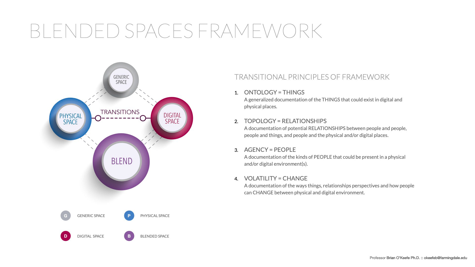
Ontology, topology, agency, and volatility
After choosing the idea to move forward with, the first step of developing a storyboard to further explain the product is by defining the elements below of Ontology (Things), Topology (Relationships), Agency (People), and Volatility (Change) for the product I would be creating. Defining the elements allows me to discover how my product would create relationships and engage with people.
Physical and Digital Transitions
Physical, digital, or blended spaces
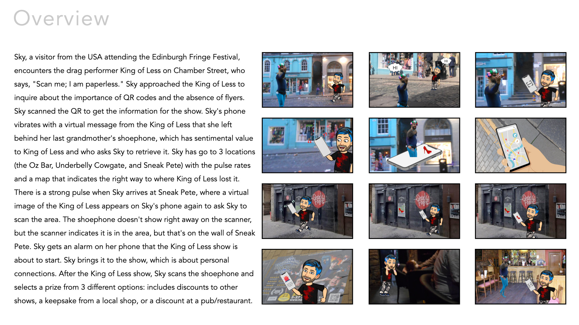
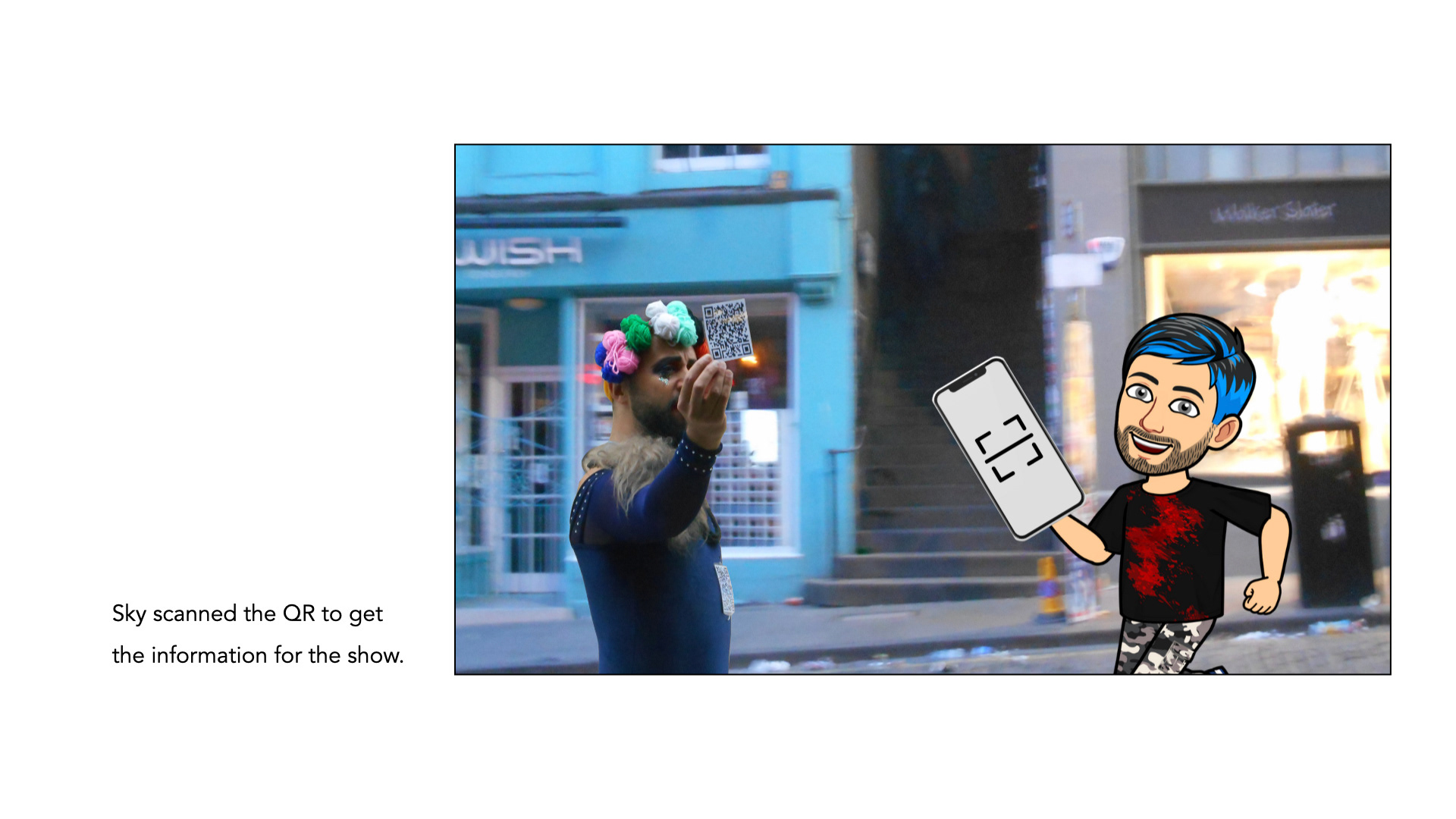
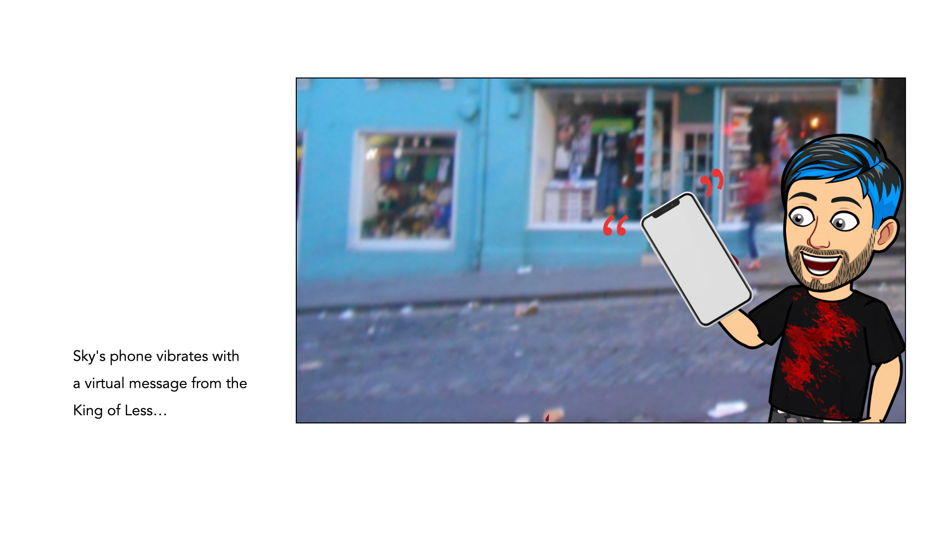
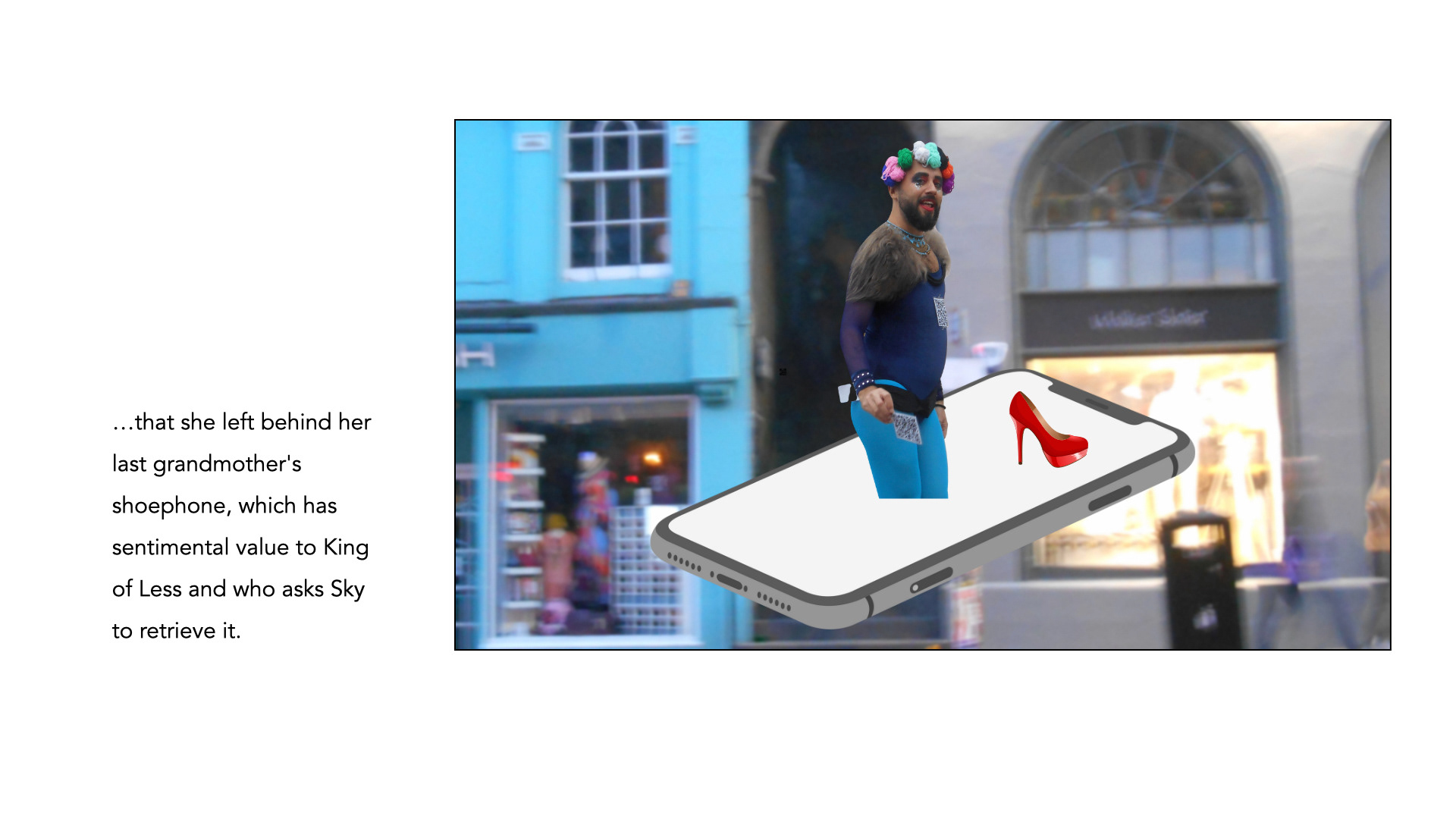
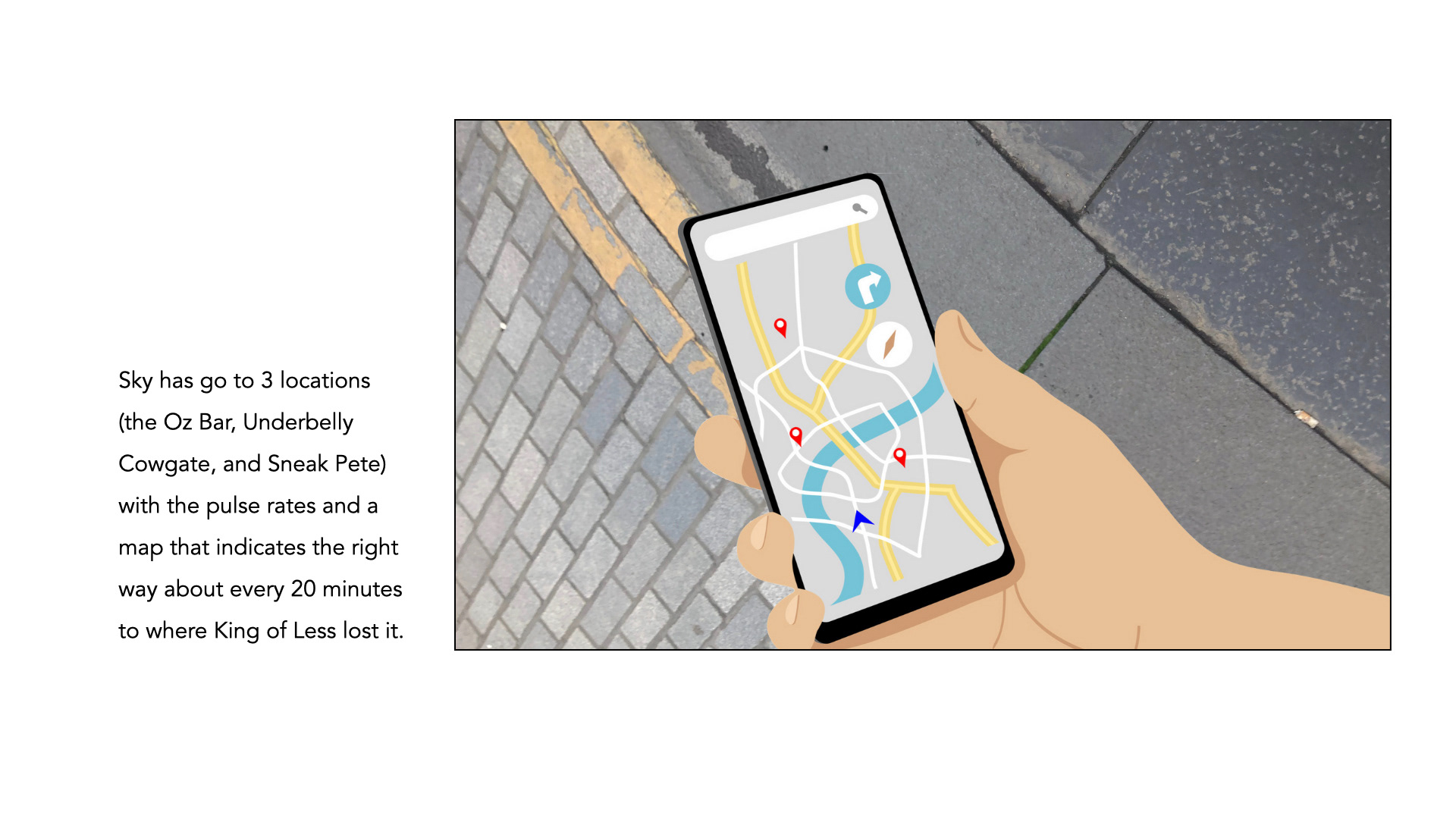
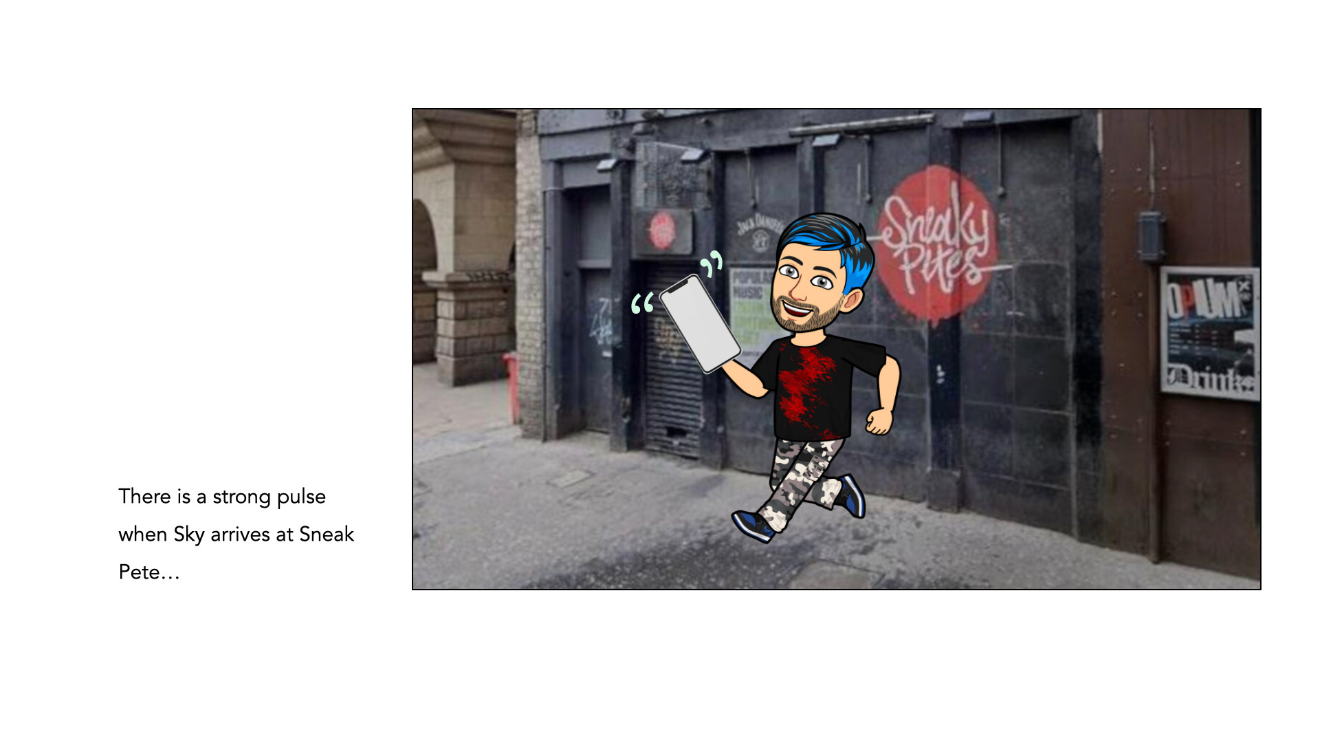
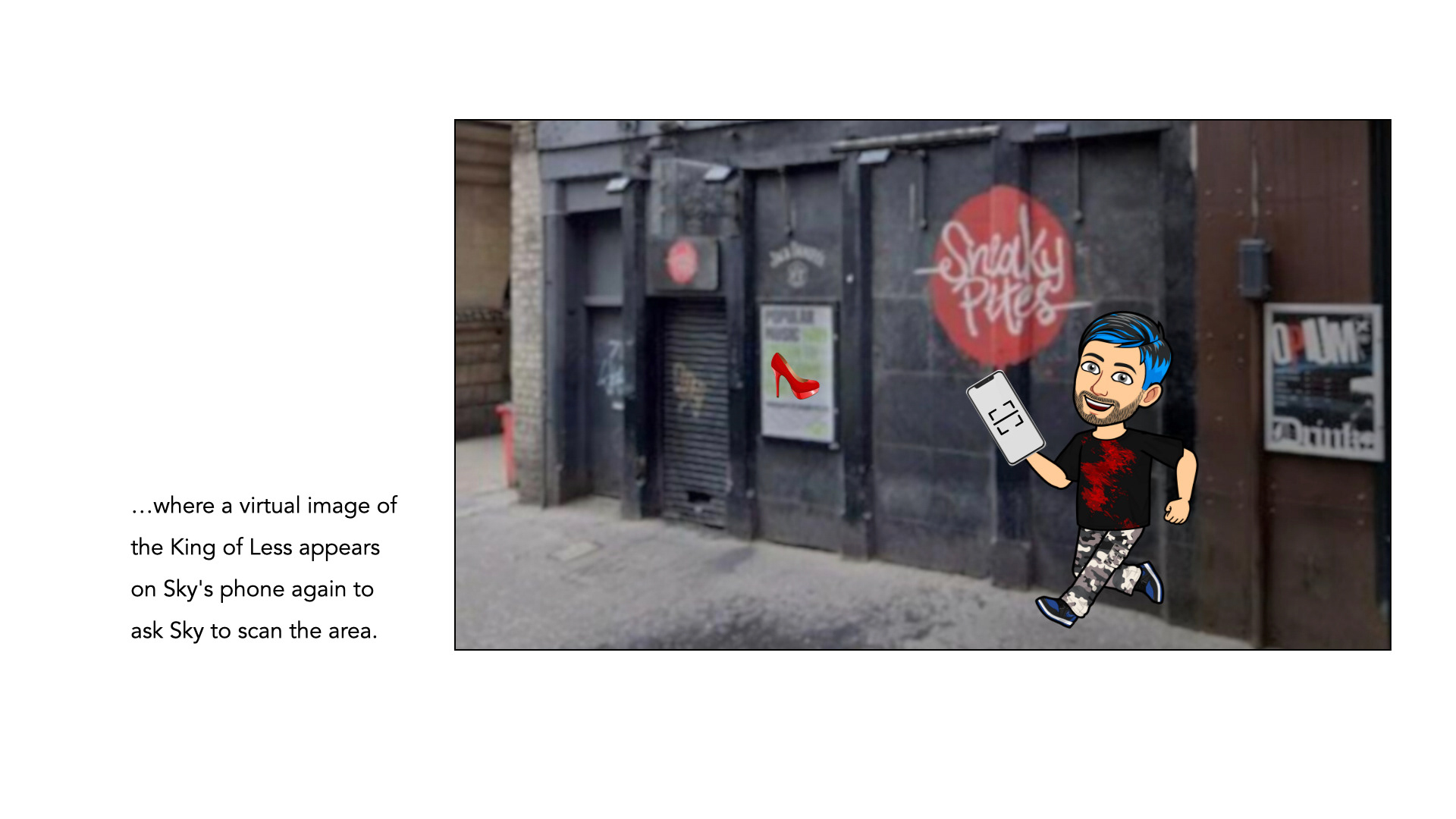
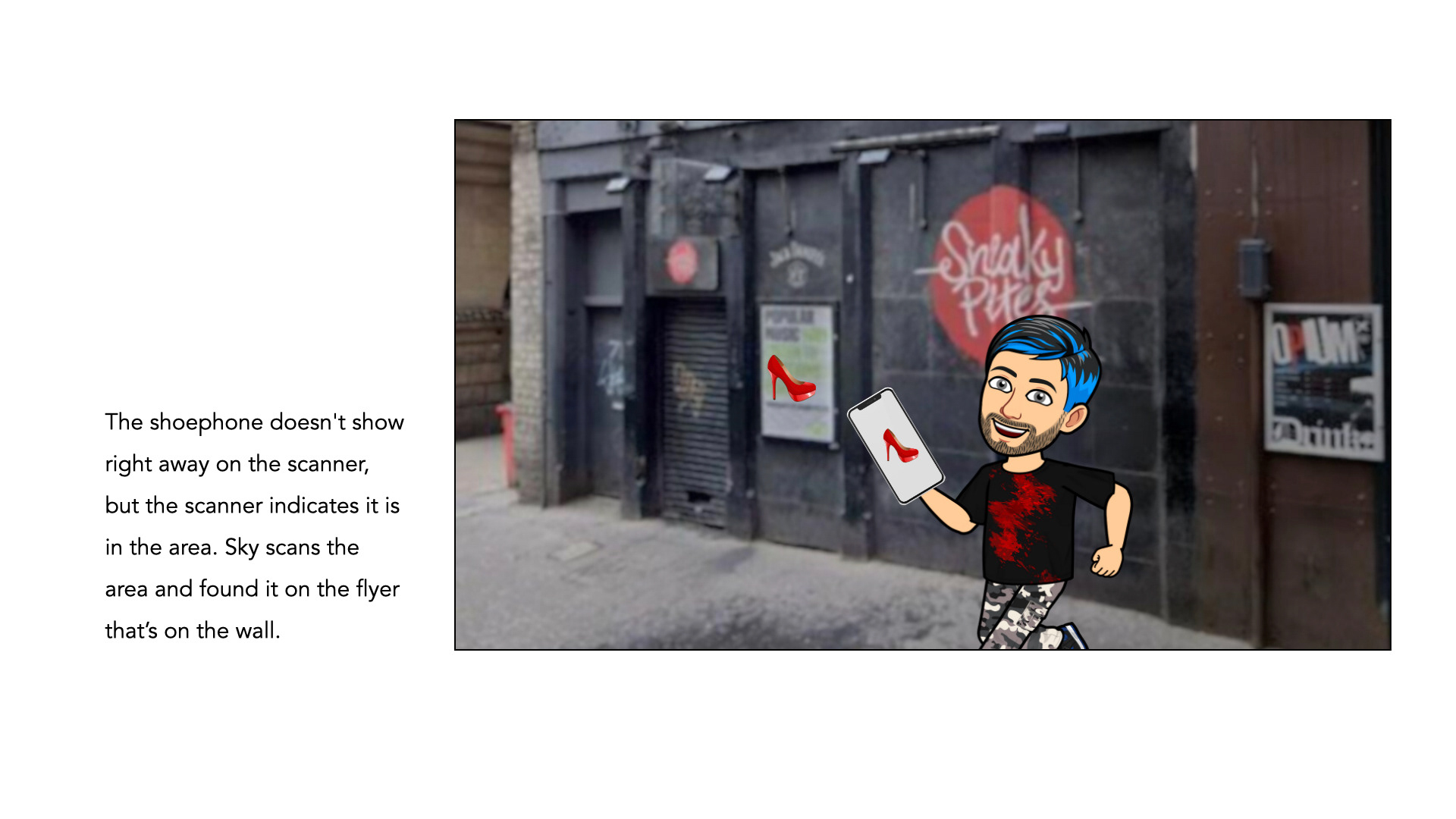
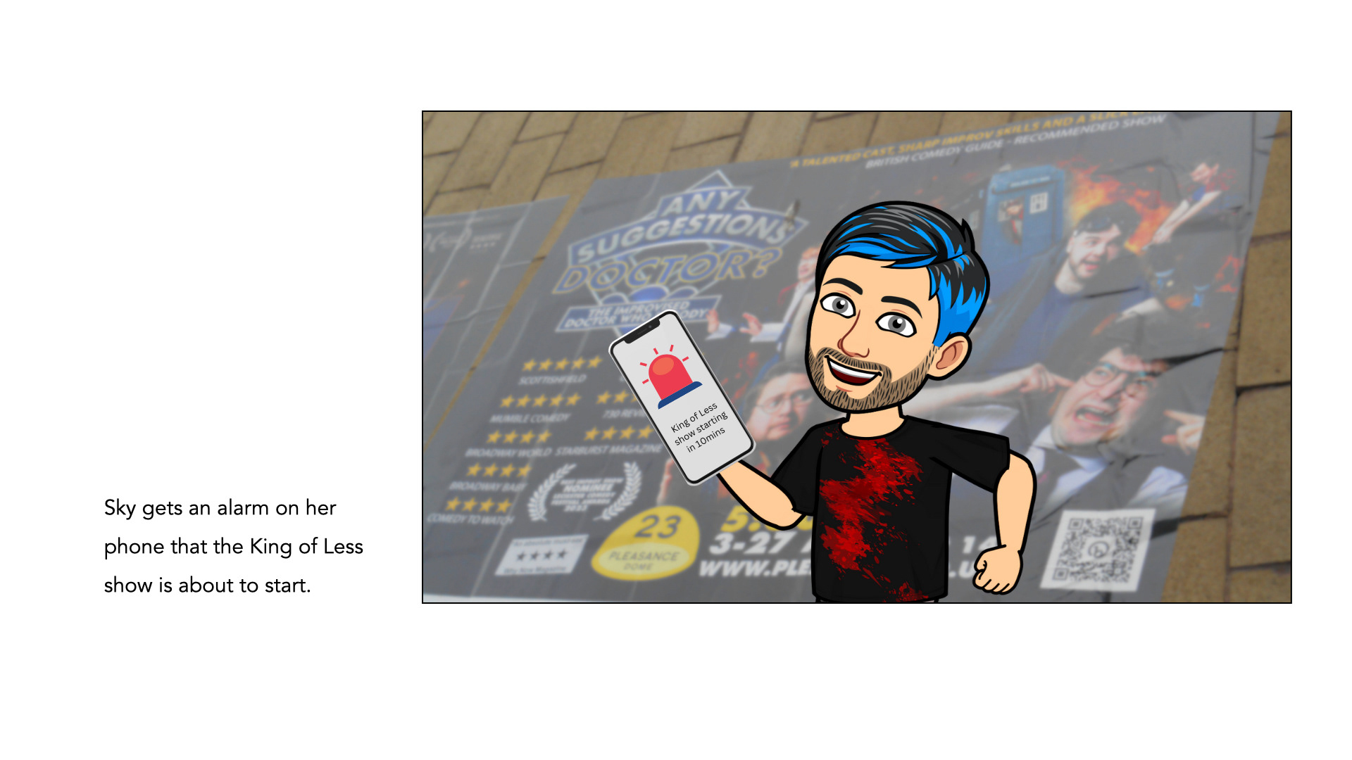
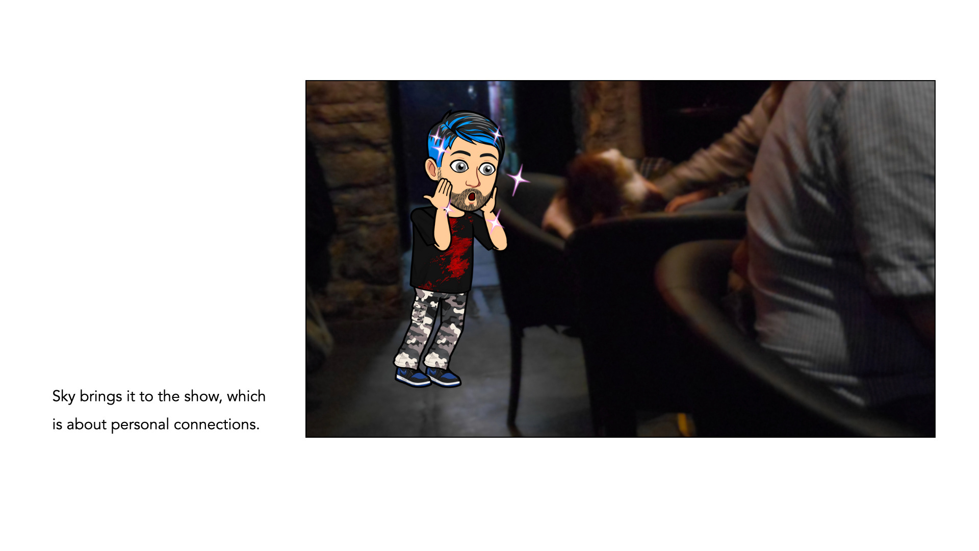
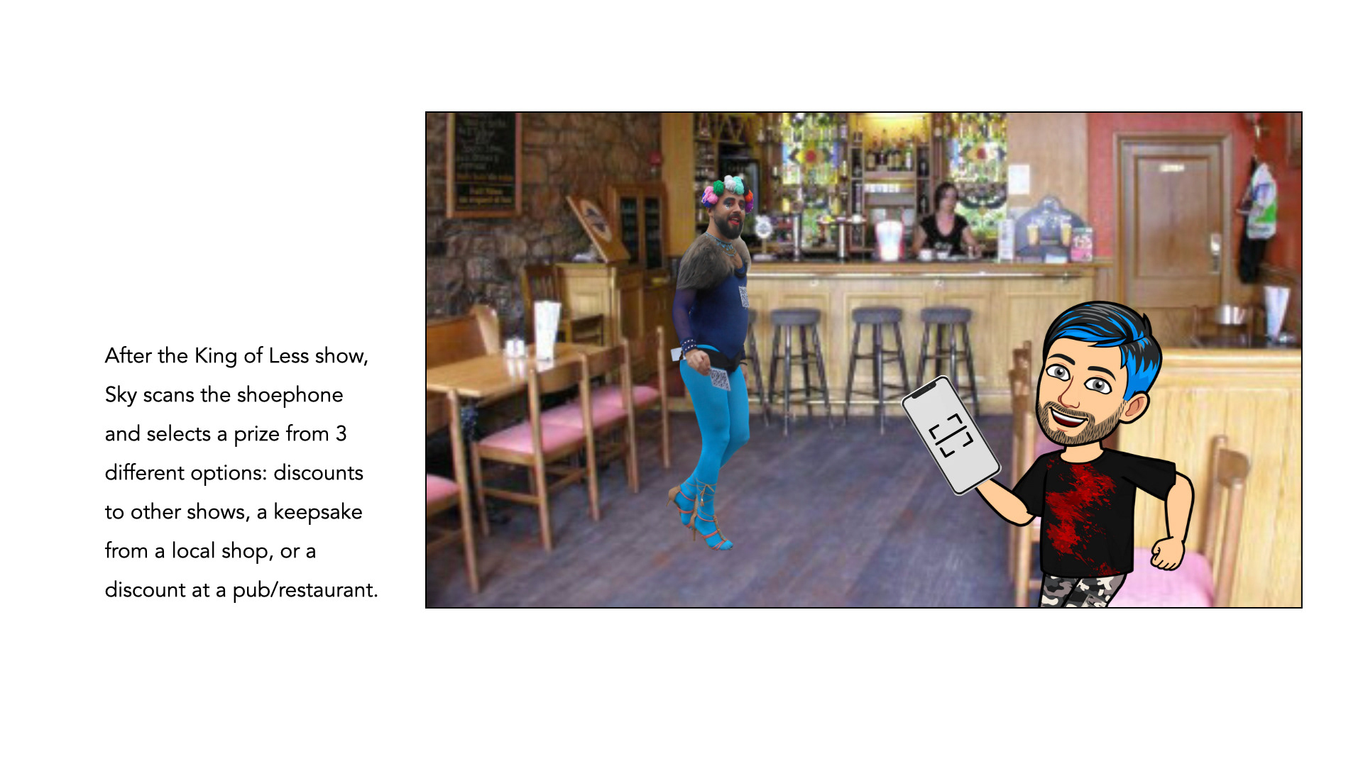
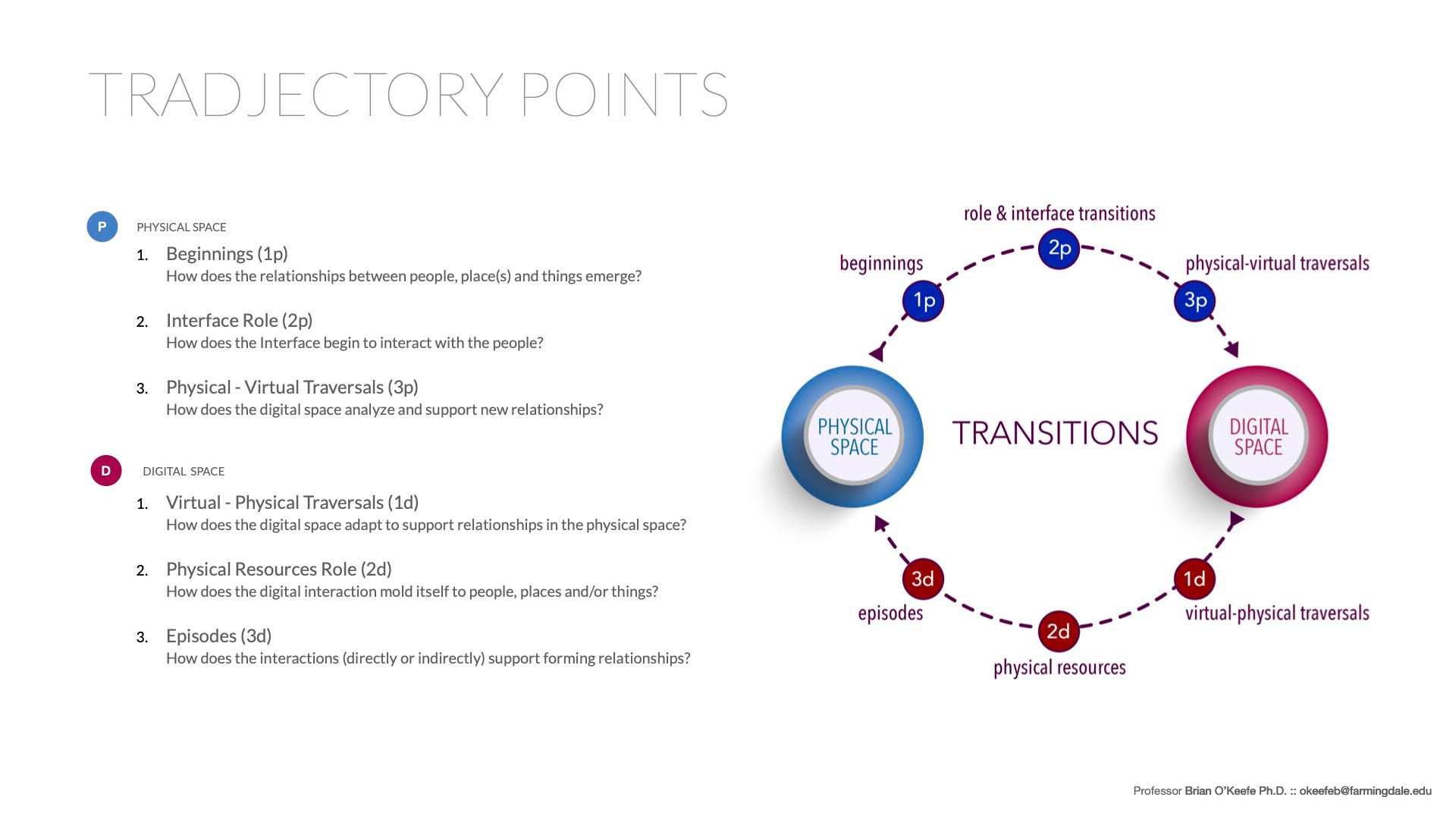
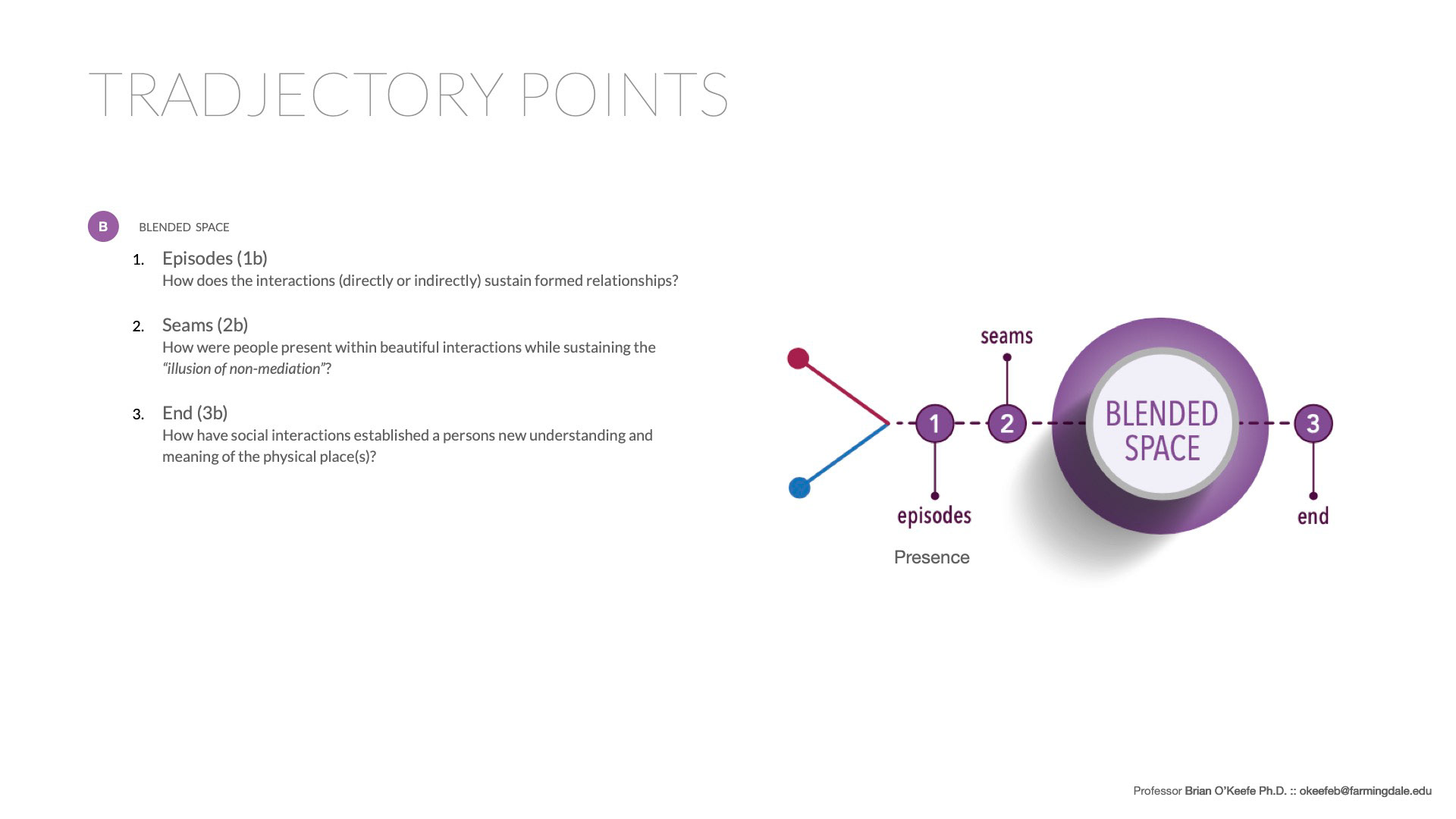
While creating my storyboard, it was important to keep in mind of the physical, digital, and blended space. The storyboard consists of 12 cells in which 4 cells are used to showcase each of the three spaces. Below shows each of the three spaces and how they transition into another space. By following these transitions, I was able to illustrate my storyboard effectively in terms of showing how the product can be used in the three spaces.
Building a Script
3 touchpoints per space
In the second step of developing my storyboard, I began to write up a script while following the transitions listed below. Since there are three main touchpoints in each transition, those are shown through the solid colored circles. The fourth touchpoints, which are optional and can be positioned in any of the three spaces, are indicated by the dotted circles.
Timeline of Touchpoints
Time, place, and space
After writing the script, I described the time and place of each touchpoint and organized them
through a timeline.
through a timeline.
Storyboard
